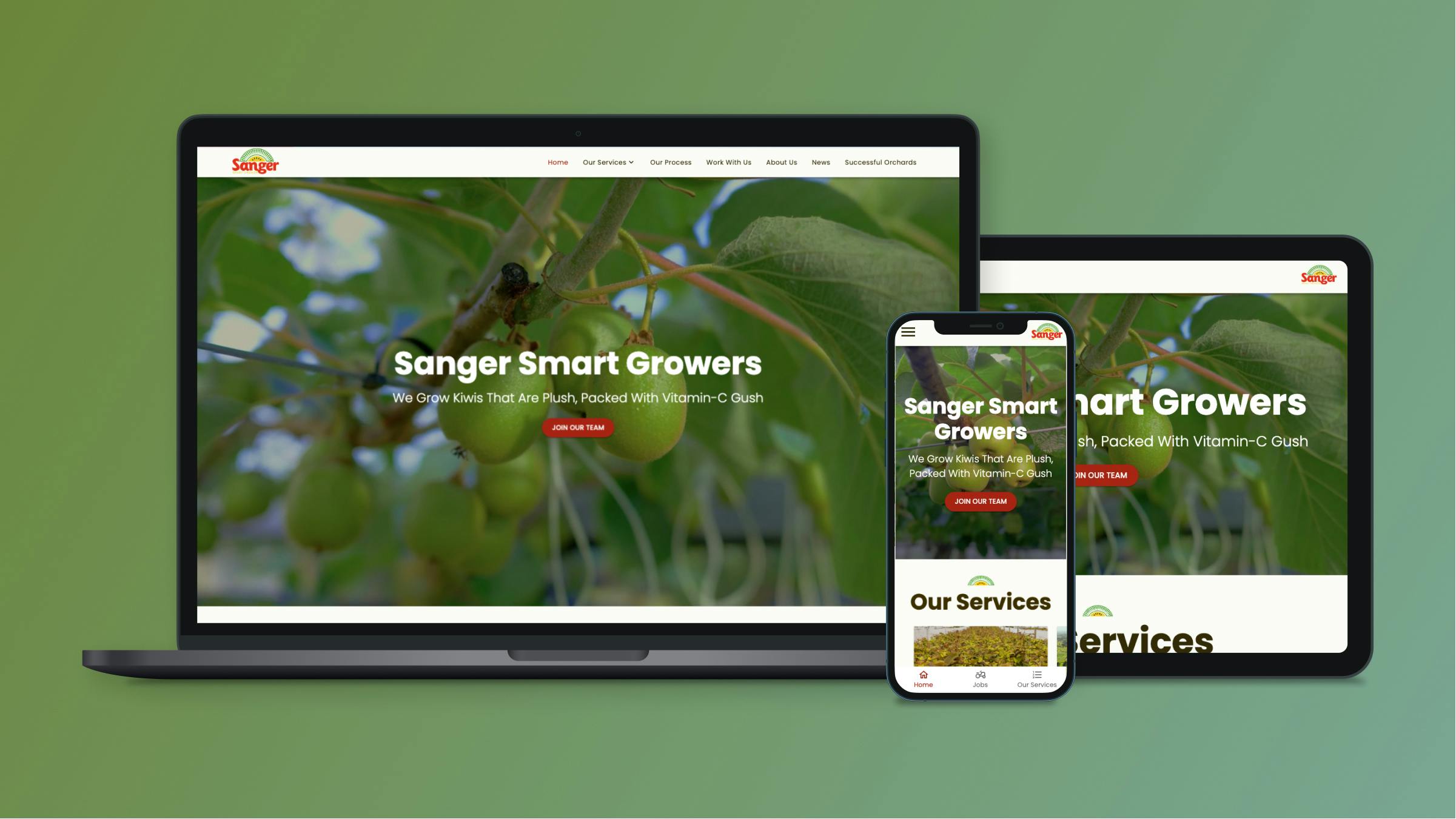
Sanger Smart Growers - Web Design & Development
Website Link:
Sanger Growers
A Story of Perseverance and Self-Belief
Gary is an Auckland-based kiwifruit grower who established his orchard in 2015; prior to that has had a managerial level of experience in managing the orchard and its day-to-day operations. He has done everything from building orchard structures to planting and installing irrigation.
Goal
Sanger Smart Growers approached us with two specific goals in mind: to create a website that would enable them to connect with potential employees seeking seasonal work and potential orchard owners looking for a dependable contractor.
Design Process
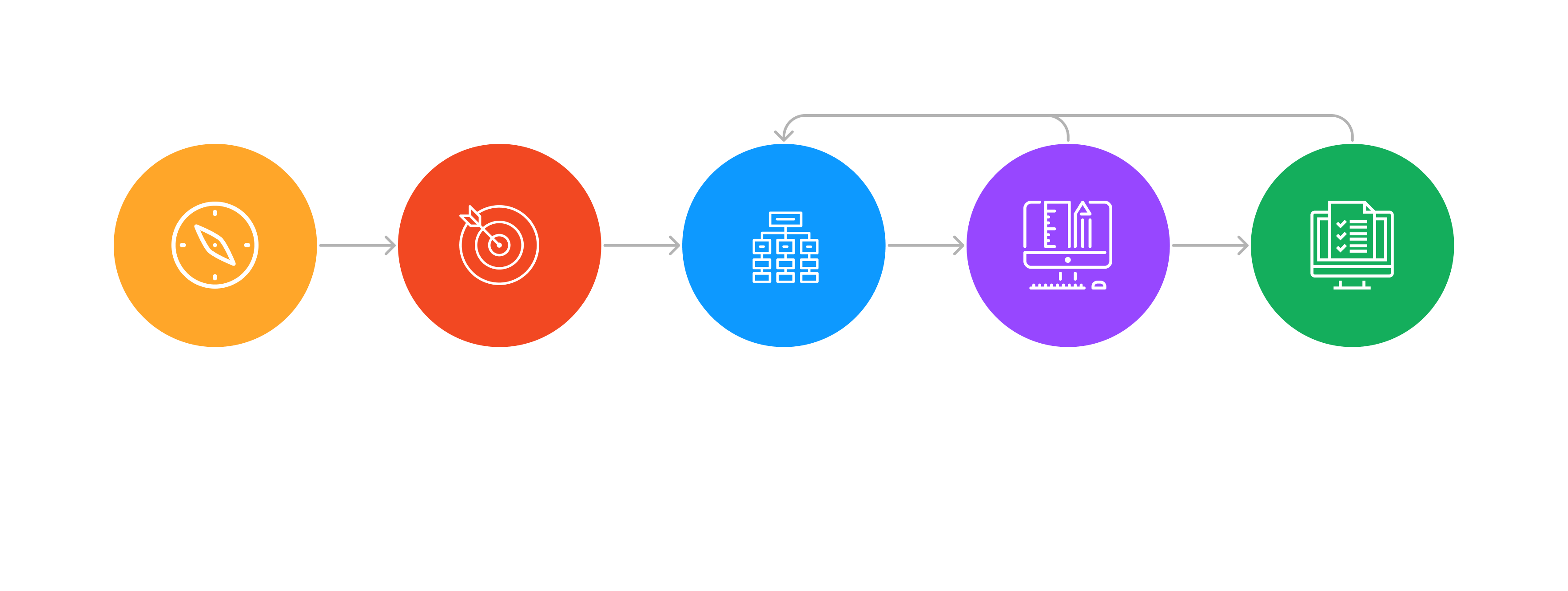
Discover Phase
Stakeholder Interview Questions
General Website Discovery Questions
- Why do you want a new website?
- What’s the primary purpose of the new website?
- Who is your primary audience?
- What SMART goals will indicate success in making an investment in a new website?
- Who will be responsible for reviewing and providing feedback on the new website design?
- Who will have final approval for the website prior to launching?
Functionality Questions
- Identify 3-5 websites you love. What do you like about the style, features and functionality?
- What elements do you like and dislike about your top three competitors’ websites?
- What functions are absolutely necessary for your new site?
- Thinking about things like chat functions, maps, multiple languages, events calendars, member logins, blog, forms, etc., what are your must haves, should haves, could haves, and won’t haves?
Content Questions
- What key pieces of info should be available on every single page of your website?
- What do you want newcomers to know or do on your site?
- What do you want current customers to know or do on your site?
- Do you want automated emails to be triggered by actions that prospects/customers take on your website?
- What content will you continue to publish after launching the site?
- Do you have photos and visuals that can be used for commercial purposes or should you budget for stock or custom photography?
Design Strategy
Executive Intent
A new website is being launched to assist users in applying for job vacancies. The website will enable applicants to fill out the application form online. In addition, the website will also provide information about the different services offered by Sanger Growers.
Target Audience
Seasonal workers who are seeking job opportunities in the kiwifruit industry, as well as kiwifruit orchard owners who are interested in exploring the services provided by Sanger Growers. The new website is aimed at simplifying the job application process for seasonal workers and providing kiwifruit orchard owners with easy access to information about Sanger Growers’ services.
Major Competitors
Khinda Contracting, Prabh Horticulture, Kerikiwi Orchard Management Solutions, Quality Kiwi Services, Auckland Hort Services. None of these competitors have a website.
Define Phase
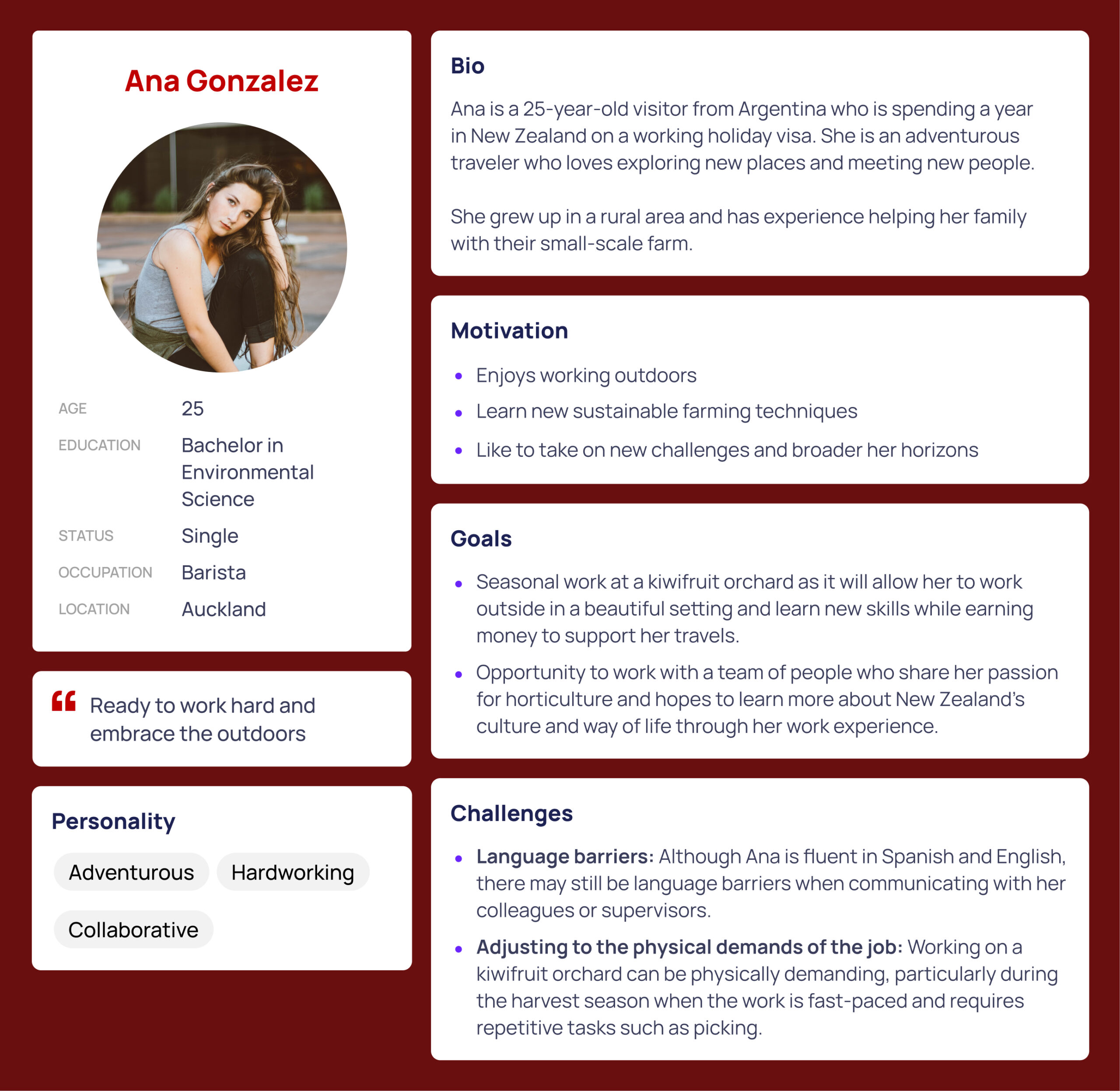
User Personas
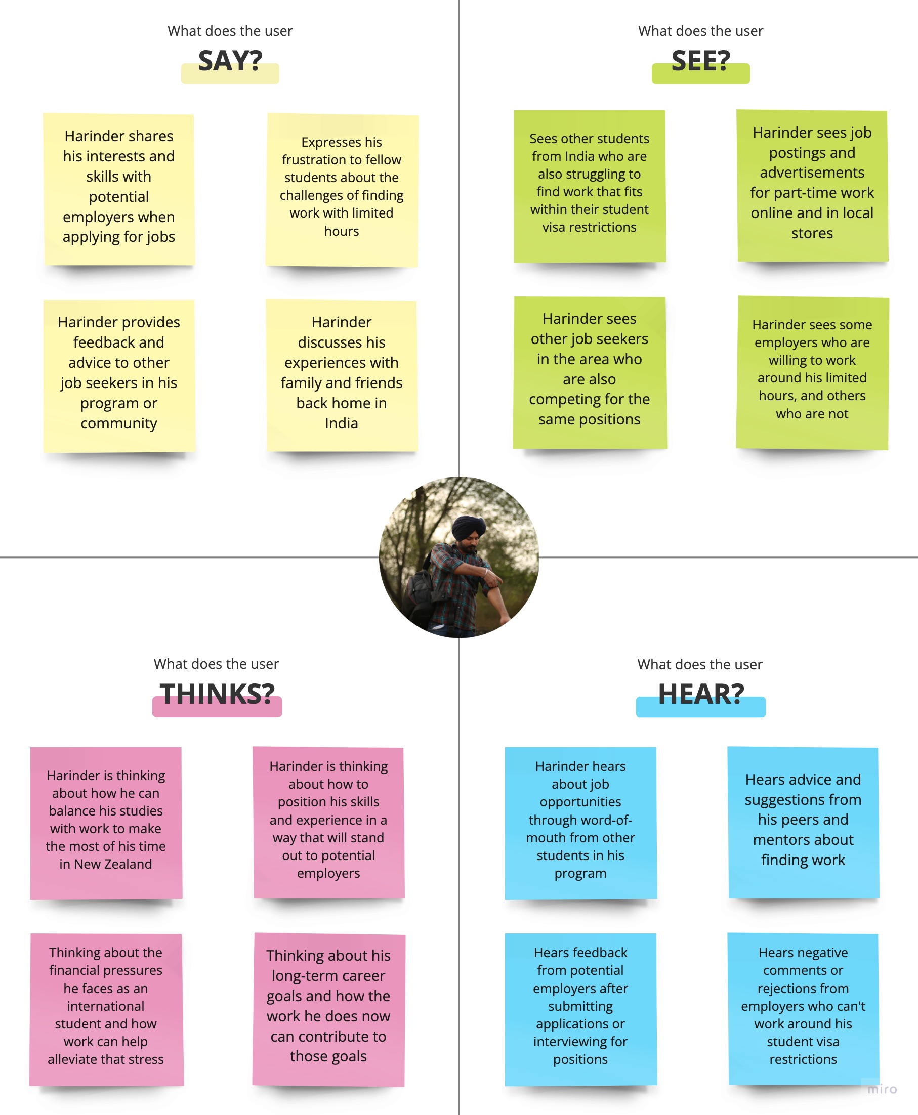
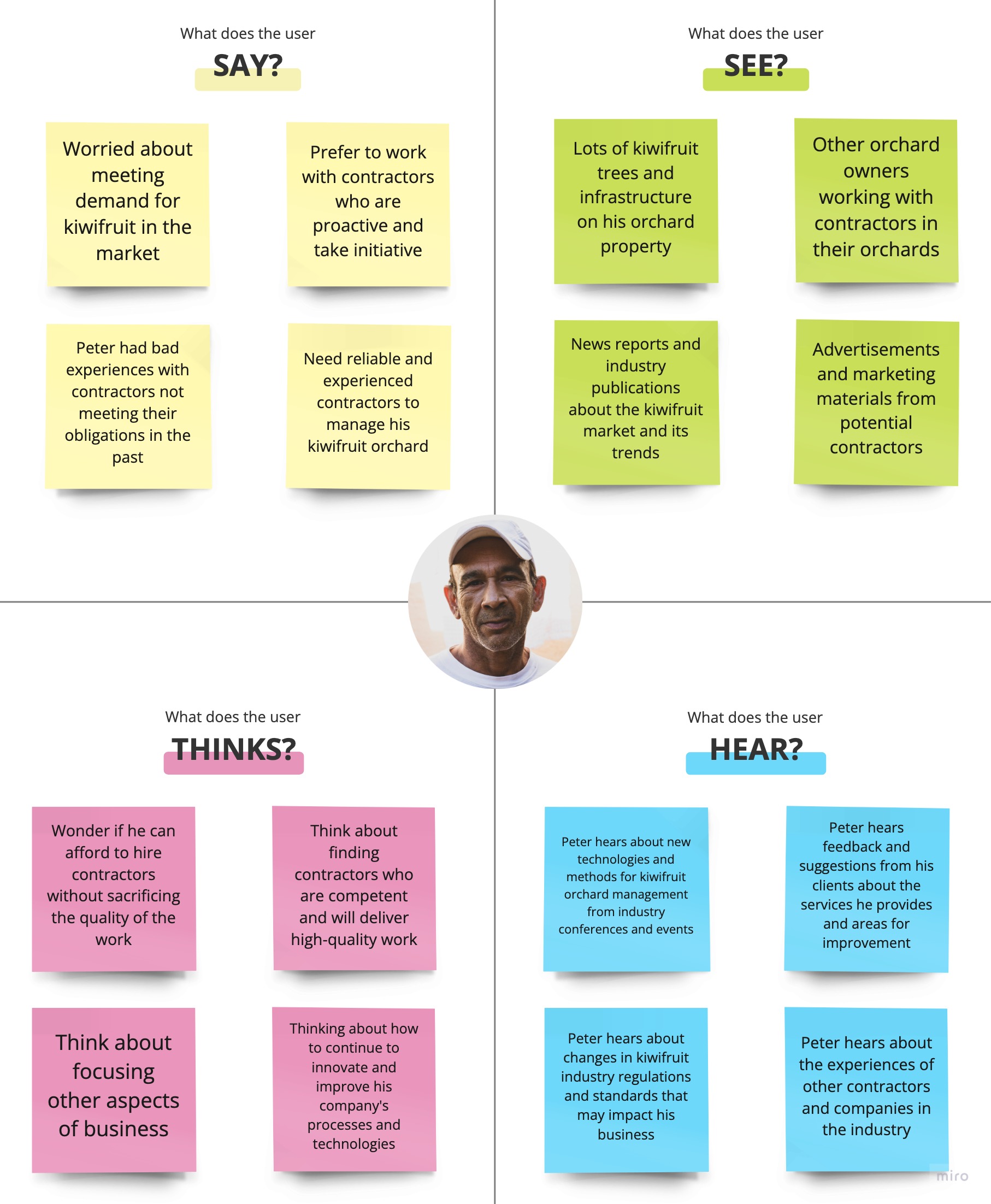
Using the information gathered through research, I developed three distinct personas that represent the target user group. Each persona was created to capture the unique characteristics, goals, and pain points of the individuals within the group.


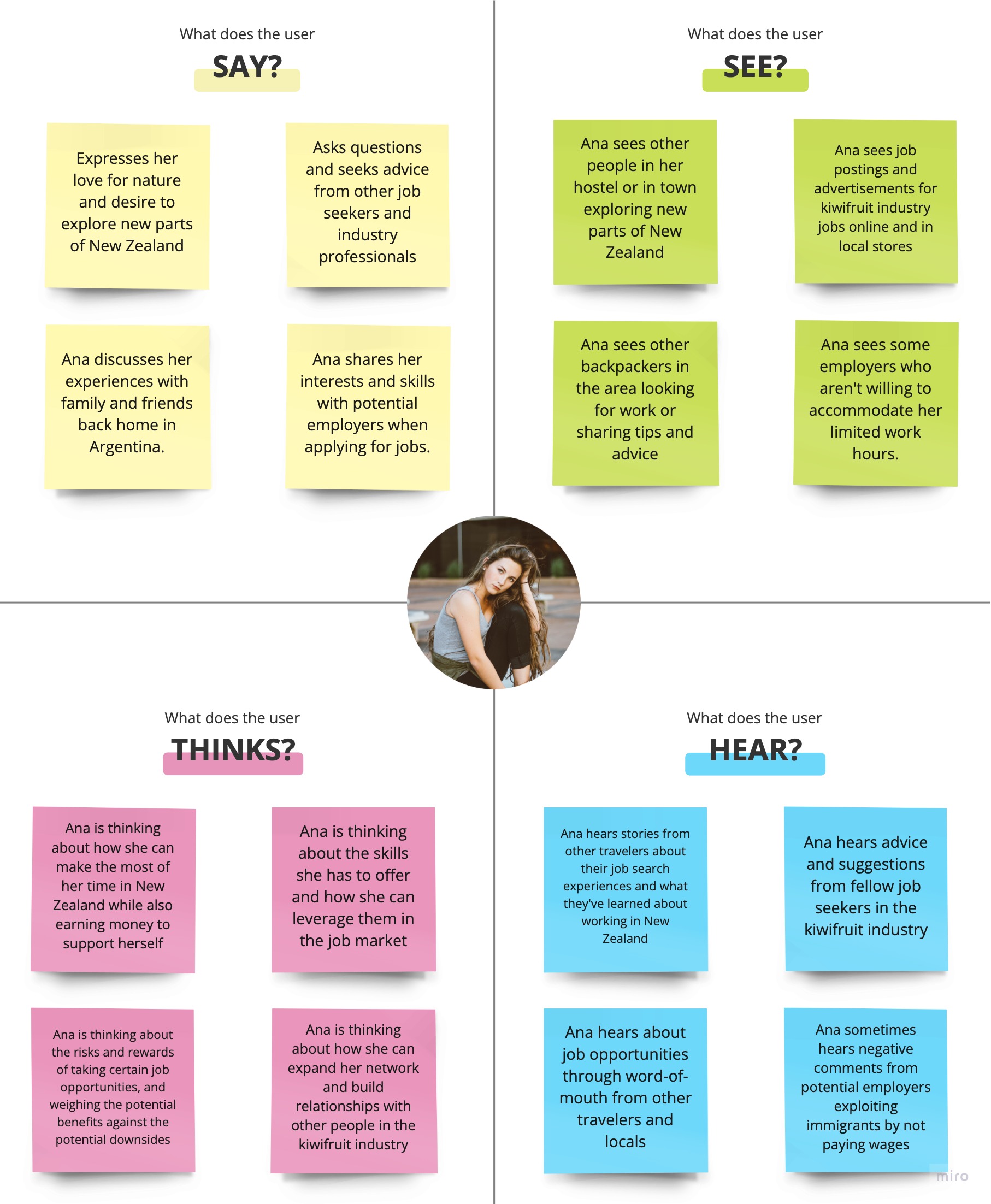
Empathy Mapping
To gain a deeper understanding of user behavior and decision-making, I utilized the Empathy Mapping Method. This involved creating a collaborative visualization to capture and articulate insights about a specific user group. The process of creating an empathy map allowed us to externalize knowledge about the user group and develop a shared understanding of their needs. By doing so, we were able to make more informed decisions regarding how to design products or services that best meet their needs.
User Journey Mapping
Using the insights gathered from the user research, I have developed a customer journey map to gain a deeper understanding of the key Pain Points, Challenges, and Mindset that users may experience, as well as identify potential opportunities.

Brand Attributes
Brand attributes are the unique characteristics that define a brand and set it apart from its competitors. These attributes may include factors such as the brand’s culture, customer base, tone of voice, emotional connection, and overall impact.

Ideate Phase
HMV Statements
“How Might We” (HMW) questions are a great way to kick off brainstorming and ideation sessions, as they encourage exploring ideas that can address design challenges. HMW prompts can help to generate a range of possible solutions and spark creativity during the ideation phase.
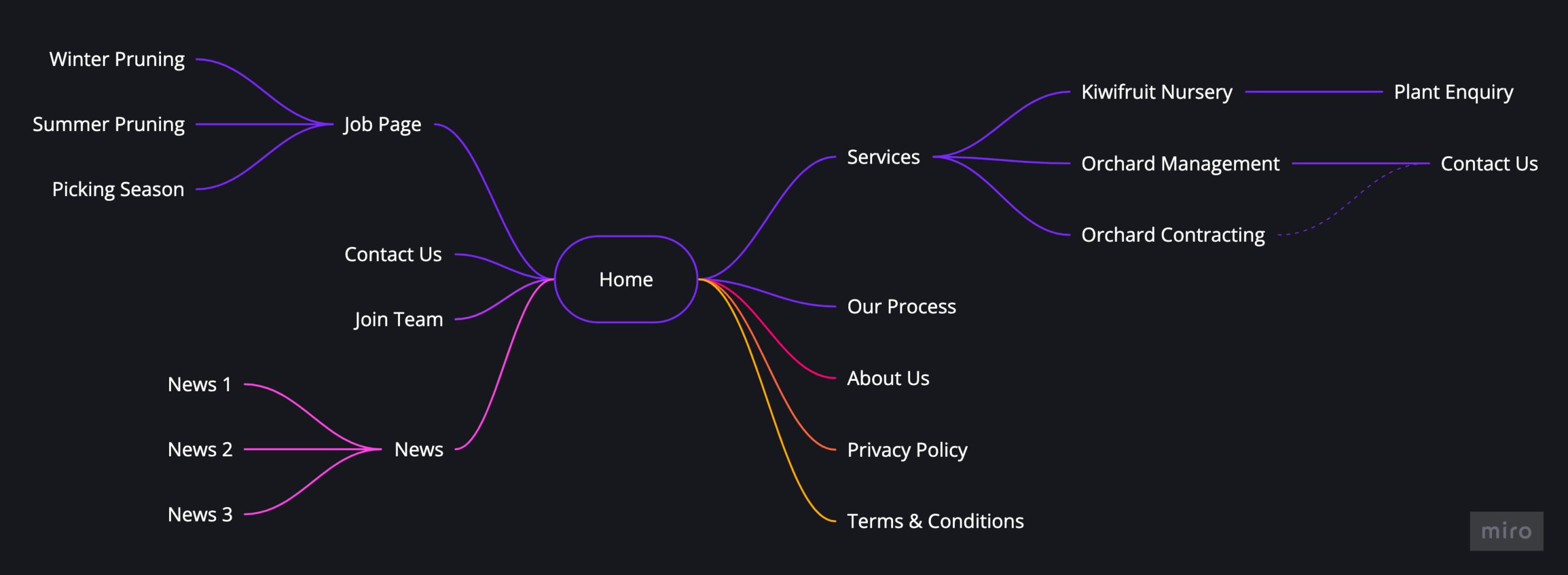
Information Architecture
Information architecture (IA) is the process of organizing, structuring, and labeling content in an effective and user-friendly way. It involves creating a clear and intuitive navigation system and hierarchy that makes it easy for users to find and access the information they need.
Design Phase
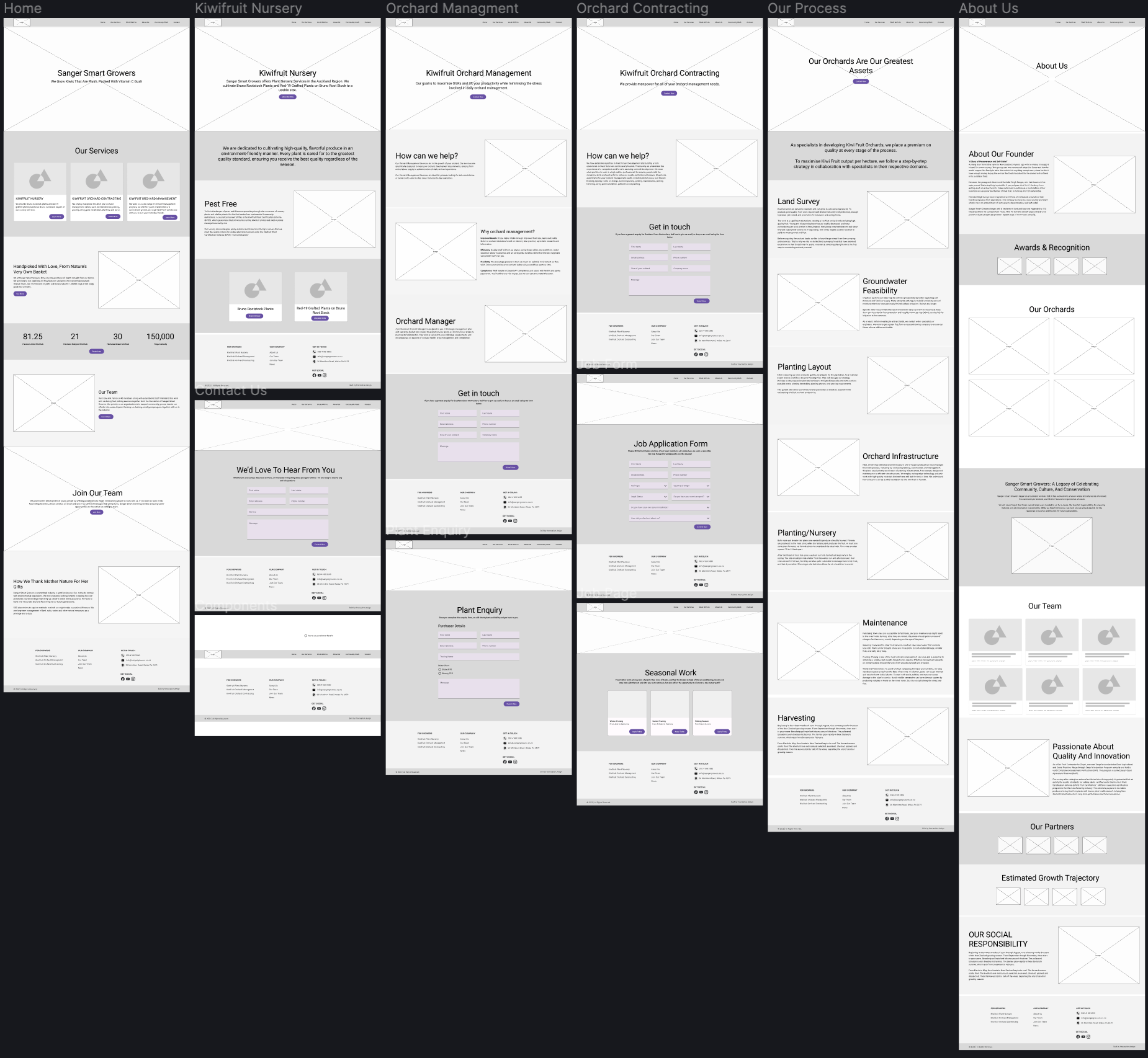
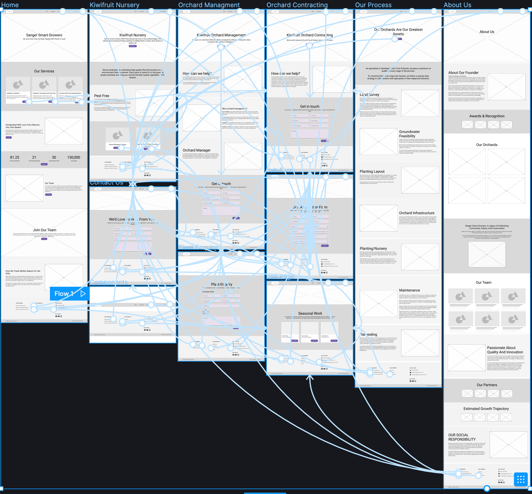
Wireframing
Wireframing is the process of creating a basic visual representation of a digital product, such as a website or mobile app, to show its layout, structure, and content organization.
Google Material Design System
The Material Design system is a set of guidelines and resources for designers and developers to create digital products with a modern and unified look and feel.

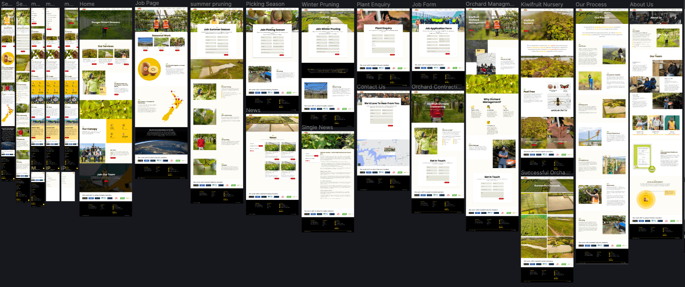
Hi-Fi UI Design
Using insights gathered from user research and analysis, I developed the final UI design prototype.
Testing Phase
User Feedbacks
After creating a prototype, We tested it with five users from our target audience, who provided both positive and negative feedback. Based on their insights, our team identified opportunities to enhance the user experience by iterating over the Hi-Fi design.
Positive
- The layout is intuitive and easy to navigate.
- The information is presented in a clear and organized manner
- I appreciate the use of visual cues to help guide me through the process.
- The functionality is seamless and everything works as expected.
Negative
- Home page video was hidden behind the content.
- Successful Orchard page has cards with no margin to distinguish from each other
- Successful Orchards page links should be in the main navbar.
- Footer menu should be collapsable.
Results
Decrease in Bounce Rate
Increase in Conversion Rate
First Contentful Paint
Crafted with these tools


