Great Spice
Website Link:
Great Spice Tauranga
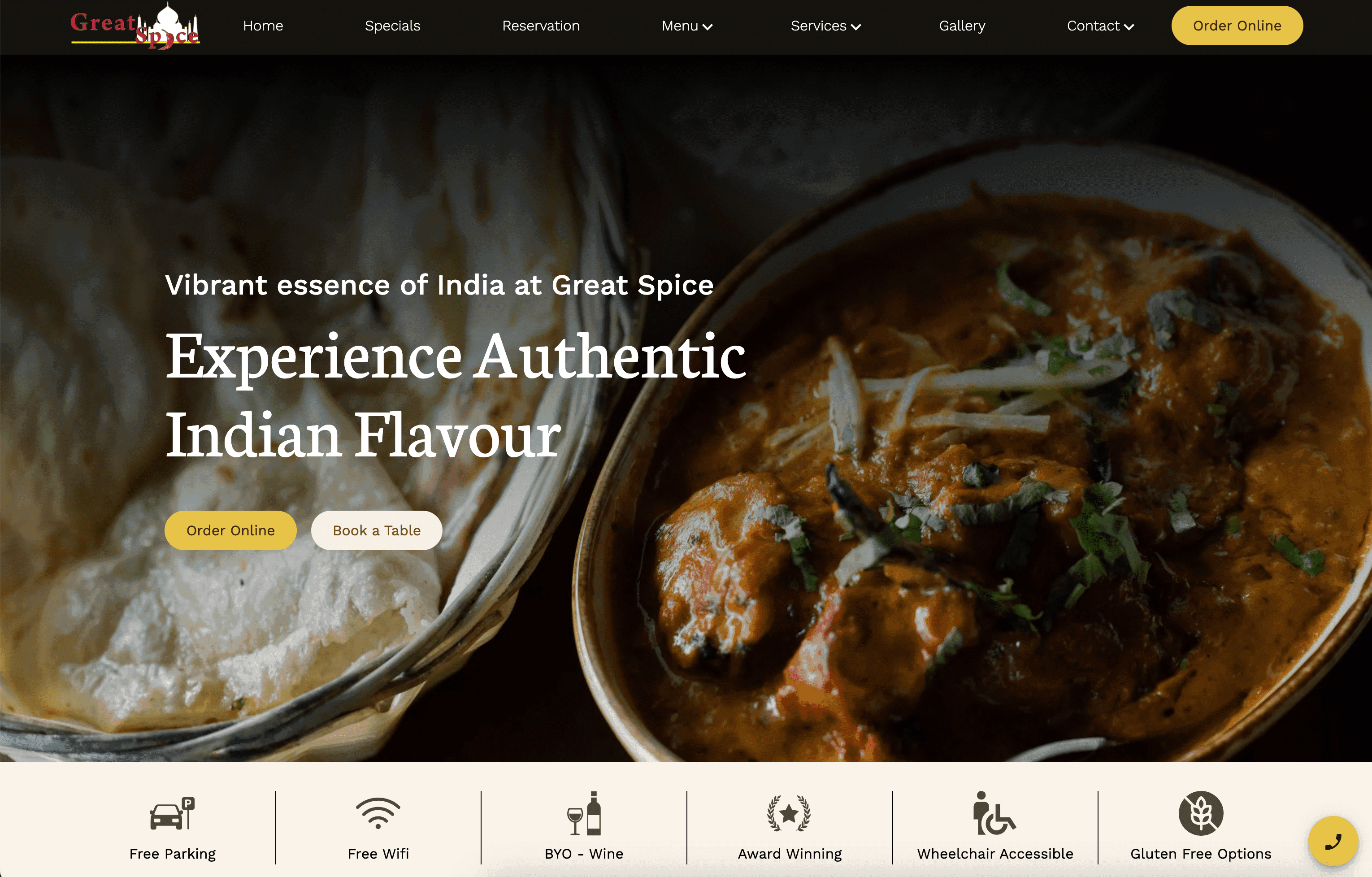
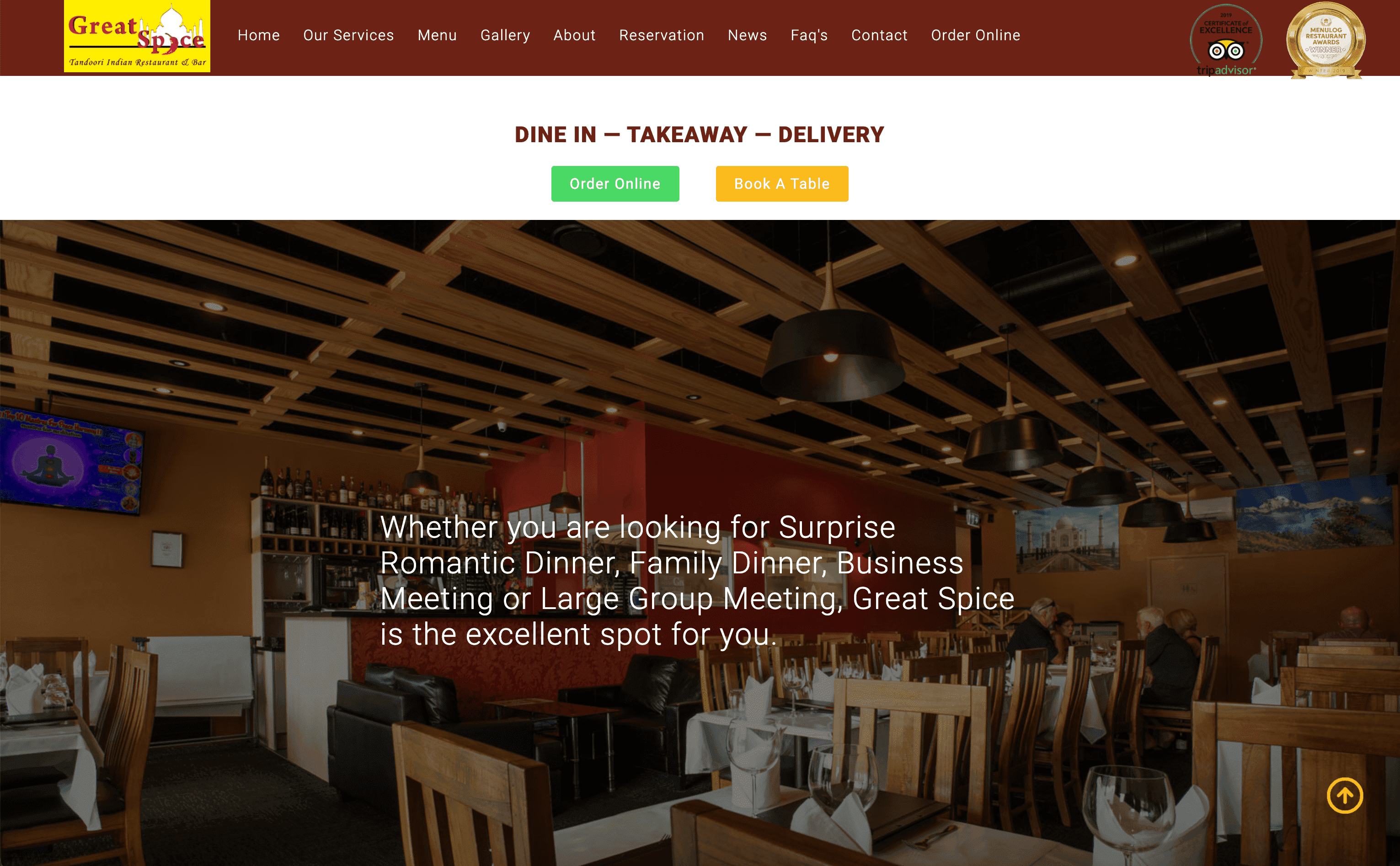
Before & After
Where Culinary Excellence Meets Sustainability
Great Spice Owner, Khem Aryal, is a highly skilled professional chef with years of experience in the culinary field.
Khem and his family are initially from Nepal, but it was when he moved to New Delhi, at the age of 16, that Khem ignited his passion for food by learning everything he could about cooking. Khem spent five years in Delhi, then three years in Dubai, before moving to New Zealand.
Project Goal
The Great Spice Restaurant, a leading ethnic dining destination in Tauranga, was facing declining online orders and user engagement on their existing website. Their previous site was not optimized for mobile, had outdated visuals, lacked an intuitive UI, and had average loading speed.
Design Process
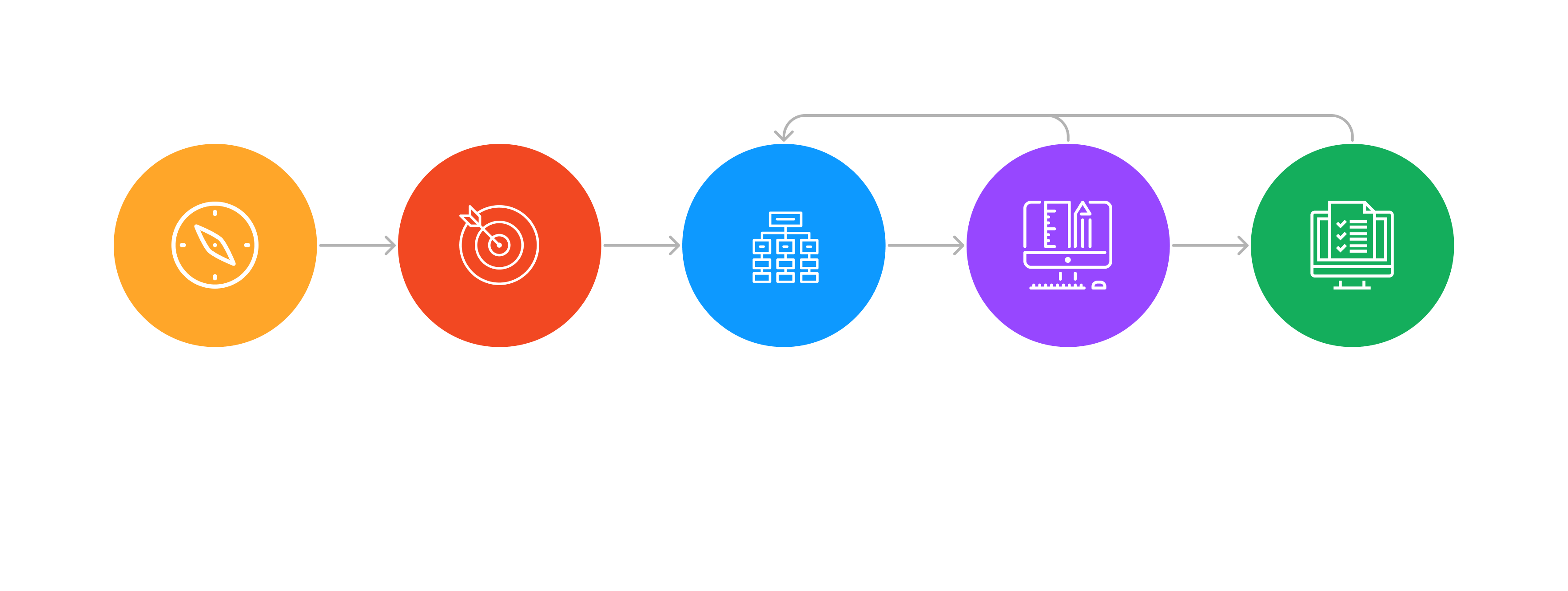
Discovery Phase
User Research
To truly understand user needs and pain points, a comprehensive approach was taken towards user research. We started by analyzing Google reviews of the restaurant, which provided invaluable feedback from actual patrons. This allowed for an immediate sense of what was working and what wasn’t from the user’s perspective. Additionally, several case studies were reviewed to better understand best practices in restaurant website design and user expectations. This combined approach ensured that the redesign was rooted in actual user needs and industry best practices.
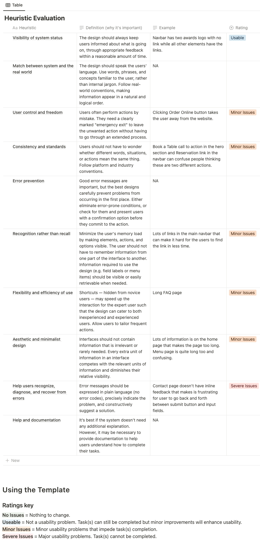
Heuristic Analysis
Before diving into the redesign, it was imperative to identify existing usability issues and areas for improvement on the current website. A heuristic analysis was conducted, evaluating the site against established usability principles.
Competitive Analysis
Understanding the competitive landscape was essential to determine what worked well in the industry and where there were gaps that could be capitalized upon. A thorough analysis of competitors’ websites was undertaken to identify:
- Design Trends
- User Features
- Content Strategy
- CTA Implementation
- Feedback and Reviews
Define Phase
User Personas
Based on the data and feedback from user research, a representative user personas were developed.

Empathy Maps
After developing our user persona, we felt the need to delve deeper into understanding the emotional and cognitive aspects of our target user’s journey. The Empathy Map was a tool we used to crystallize this understanding.

Journey Maps
With a deeper understanding of our user’s emotions and perspectives from the Empathy Map, we moved to charting out their journey with our website. The Journey Map provided a visual representation of the user’s end-to-end experience, highlighting their interactions, pain points, emotions, and opportunities for enhancement.

Ideate Phase
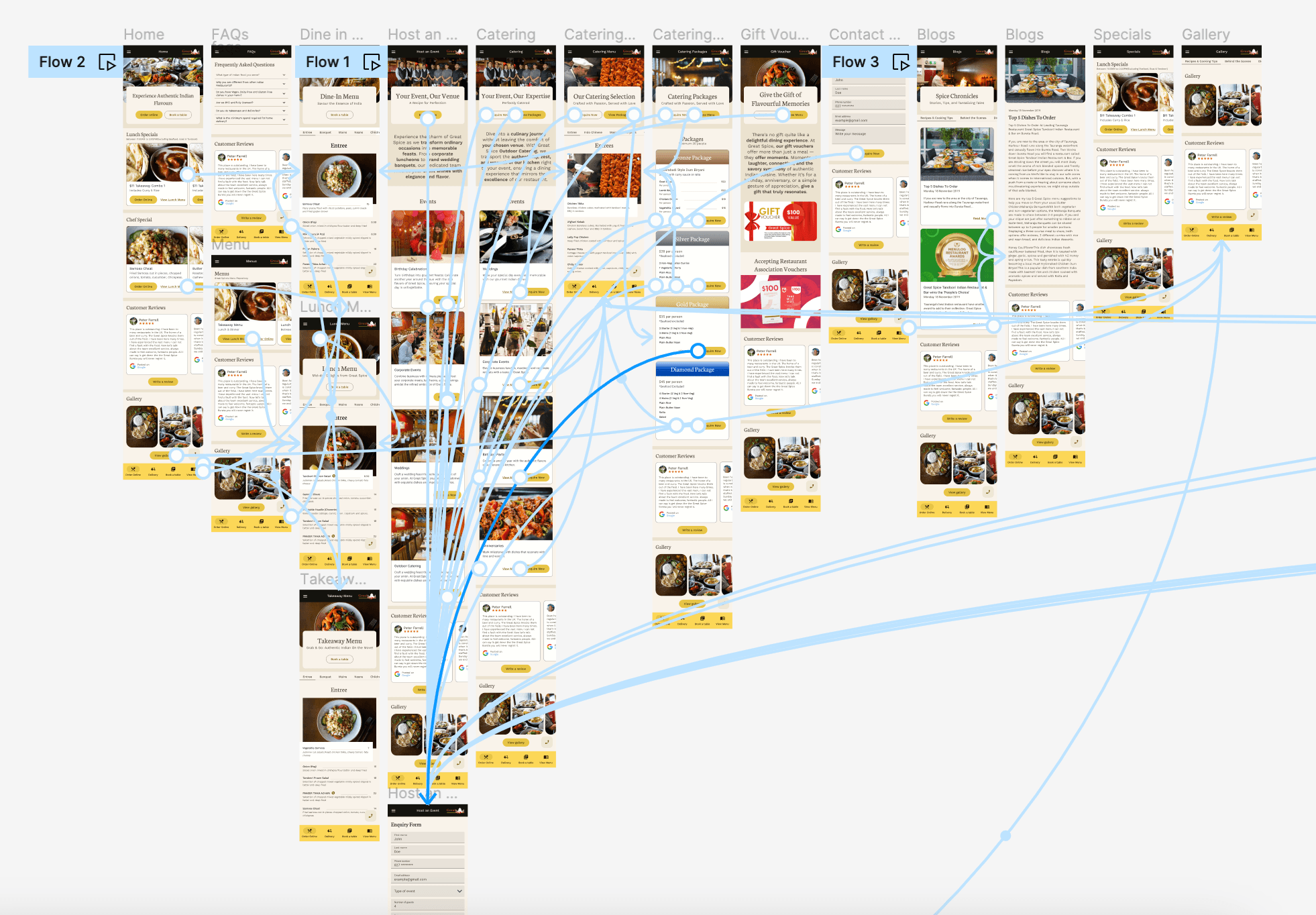
User Flow
User Flow diagram are pivotal in plotting the user’s path through the website. These flows ensure a seamless experience and are the foundation for the upcoming design phase.

Information Architecture
Information Architecture refers to the organization and structuring of content in a manner that users can easily navigate through it. IA lays out the hierarchy of information, allowing designers and developers to build a coherent navigation system.

Design Phase
Wireframes
Wireframing is a fundamental step in the design process, often referred to as the “blueprint” of a website. It represents the skeletal framework of a website and provides a visual guide representing the page structure, as well as the website’s content and user interface. Wireframes are typically devoid of color, graphics, and stylistic elements, focusing instead on layout, hierarchy, and functionality.

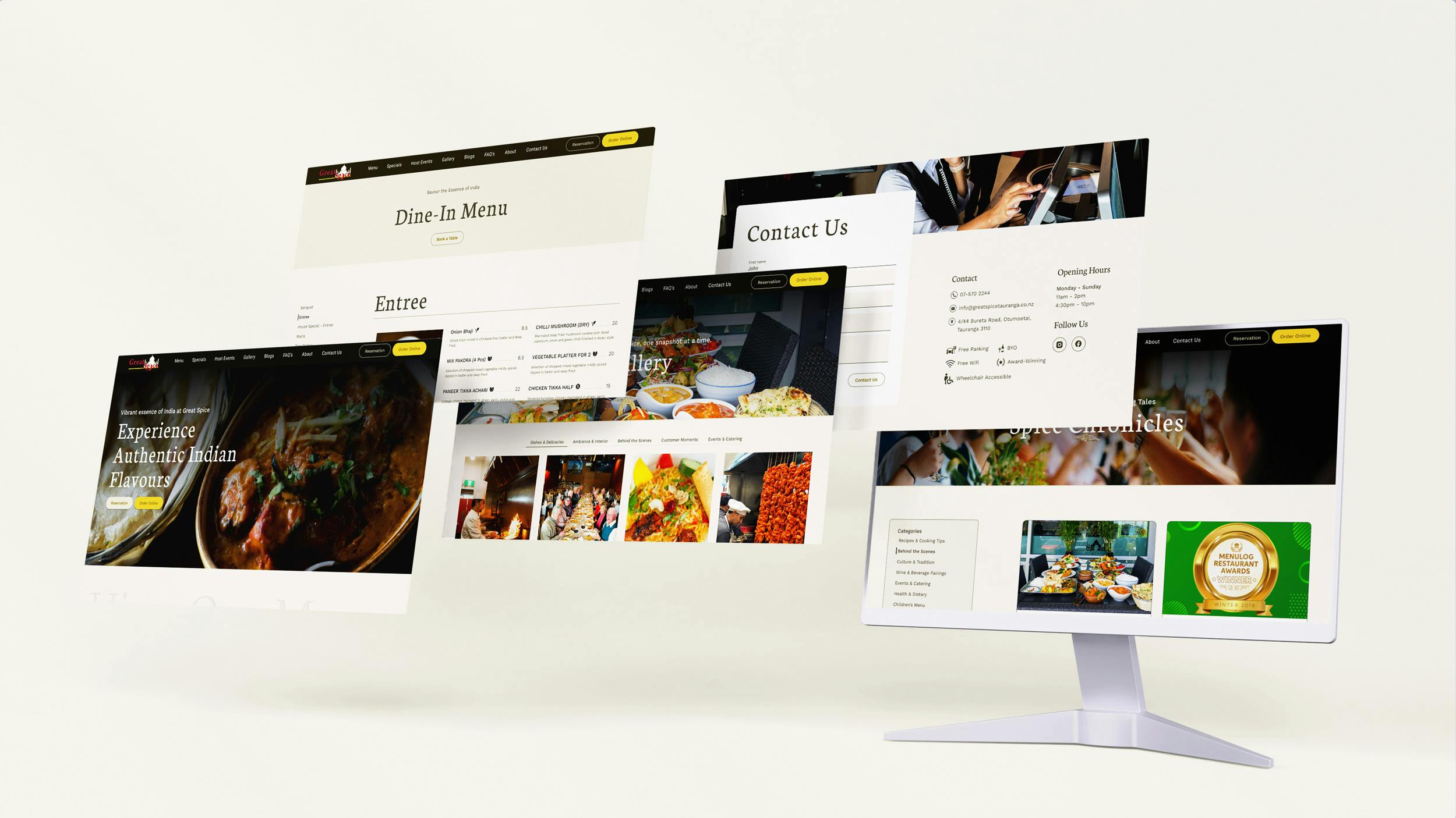
High Fidelity Design
High-fidelity designs are detailed, pixel-perfect mockups that give a clear understanding of what the final website or app will look like. This stage infuses color, typography, imagery, and other design elements to the wireframes, bringing them to life.



Development & Testing Phase
Tech Stack
With the designs and prototype in hand, the development phase commenced. This phase is where the vision transforms into a tangible product.
For this project, WordPress was chosen as the backend given its flexibility and ease of content management. On the frontend, Next.js was employed due to its performance capabilities and server-side rendering features, ensuring a fast-loading website.
Given the importance of speed and performance, optimizations were done, leveraging Next.js’s capabilities, such as lazy loading and code-splitting.

Testing
Once the development was complete, a rigorous testing phase was undertaken to ensure the website worked flawlessly across different devices and browsers.
Conclusion
Great Spice restaurant website project is a testament to the power of combining methodical research, empathetic user-centric design, and cutting-edge technology. It stands as an embodiment of a modern, user-friendly, and performance-driven website that doesn’t compromise on aesthetics. The redesigned site not only serves the restaurant’s operational needs but also offers its patrons an enhanced digital experience, setting a new benchmark in the industry.
Results
Decrease in Bounce Rate
Increase in Conversion Rate
First Contentful Paint
Crafted with these tools


